October 31, 2012

What in Samhain?

Here is the Link to the essay below by Mark Allard about my show. 


/EXHIBITION TEXT

BATISTA’S DIVINE INSPIRATION: AN INVITATION TO THE OTHER SIDE /MARK ALLARD
Creating divine icons can be a meritorious act that nourishes the spirit and brings about the existence of deities and good luck. Calgary artist Brian Batista tests the possibility of sublime experience in art. His work, DIVINE INSPIRATION, blends sacred geometry with historical references to re-imagine traditional images and cleverly conceptualize contemporary life in terms of Vedic deities and sublime mystical revelation.
The development of Vedic deities was a fusion of ideas from invading Aryan tribes - from the region of Iran, and the indigenous people of northern India. The Aryan herdsmen were less interested in rural deities and stressed the adoration of natural phenomena. The sun (Surya) and fire (Agni) were personifications of divinity. As A. A. MacDonnell describes, "true gods of Veda are glorified human beings, inspired with human motives and passions. Born like men, but immortal."1
Deities from the succeeding RigVedic era were less secure, gaining or losing prestige, and new ones emerged, replacing those that had become obsolete. Indra was considered the almighty powerful God and became Prajapati, the creator and preserver of the universe, and would be identified with Brahma in the post Vedic period. The new Vedic deities would influence Buddhism, eastern mysticism, and future religious thought generally.
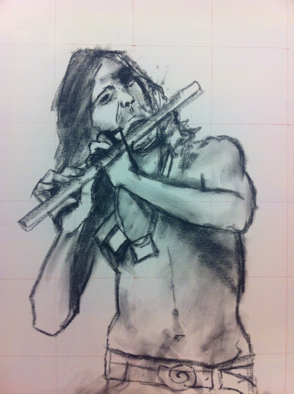
DIVINE INSPIRATION began with Batista choosing models to represent various Vedic deities. He photographs them in traditional poses and then translates the photographs on canvas using Vedic mathematics. His images are rendered differently from the one-dimensional flat Tibetan style by Batista’s use of a more Western Renaissance style. They bear bright, abstract colors and deeply representational forms and shadows. Established traditions are maintained where figures hold ritual implements to signify specific identities and narratives.
Vedic deities are very often male, but Batista intentionally confuses representations of gender to achieve a visceral effect. He hopes “to transcend representational art by creating a mystical experience” and “shake a person to their core.” He wants to “delight the eyes and ignite imaginations, with the intention of inspiring beauty, reverence, and curiosity.” Gender confusion is Batista’s springboard for achieving these goals, as is Batista’s use of chromo-depth, a technique wherein the colors are coded by depth. With the use of special glasses, the two-dimensional images become multidimensional, causing the paintings themselves to come alive.
The pieces in DIVINE INSPIRATION are bold and colorful acrylic and oil paintings on canvas, with gold and silver throughout. The largest one measures 5ft x 8ft though they all seem to be grandiose. They are hung high on the gallery walls so that viewers must look up to find their eyes. When contact is made the image meets the viewer’s gaze with a sparkle of reflective metallic elements, but only the most perceptive viewer will notice this secret message. Bright colors, textures, and patterns add depth and broaden perspective, fusing traditional Eastern iconography with contemporary Western influences. Batista intends the fusion to initiate an immediate embodied response of awe and wonder, as one might imagine the original deities did.
How we imagine ourselves has much to do with how we imagine divinity. DIVINE INSPIRATION invites us across divides between here and there and now and then. The viewer may find him- or herself on the other side of conventional and historical standards, experiencing new heights in modern spirituality. In the company of Batista’s images, one discovers, or is reminded, that spirituality can come from within. These paintings remind us that limited, skewed, and biased views of divinity affect our ability to experience ourselves as full bearers of the divine image. DIVINE INSPIRATION celebrates our potential and offers a profoundly contemporary reinvention of sublime Vedic and mystical revelation.
1 Arthur A. McDonnell, Vedic Mythology (Delhi: Motilal Banersidass Publishers PVT. LTD., 2002, first edition 1898) page
2. In-person interview between Allard and Batista in the artist’s studio, September 22, 2012, Calgary, Alberta.
3. Also from September 22, 2012 interview, as above.

/WRITER BIO

/MARK ALLARD describes himself as a “guerrilla journalist,” referencing his time with the Zapatistas in Mexico, paramilitaries in Northern Ireland, and a three-month sojourn into off-the-radar Ethiopia. His first novel, Regressions, was released in October 2012.

October 29, 2012

KALI - Goddess of Time and Change

If you read yesterday's post you are probably licking your chops to see what developed next....
After much pondering I took a big leap. I knew I wanted the green skull to be engulfed in flames and I knew I wanted to add a dancing ribbon around the figure. After some soul searching and plenty of gazing at the piece I decided to do a graduated ribbon of partial flame.
Painting the flames/ribbons takes a lot longer than I usually expect. I work right on the Canvas so there tends to be a lot of wiping away and repainting to get it the way I like. I used a series of bold colours right out of the tube as the base blending dark cadmium to cad yellows to green.
I painted the flames to come out the the green skull and have some of the flame overlap the leg, this should create a pretty cool illusion when viewed thru the 3D glasses!
I continue to block in the light cadmium red bone structures, which end out looking like a neon orange once painted. The blend of the red to orange ribbon can be seen here and some of the internal ribbon shapes unfolding are beginning to be developed.
I began to rub in a dark brown around the edges of the camera to help punch it up further.
I go back into the skull with a dark green, Viridian right out of the tube, to punch it up further and give it more shape.
I then painted a silhouette of a king cobra in pure ivory black being held above the silver bowl in Kali's outstretched and foreshortened grip.
I blocked in some of Kali's hair.

And then put in softer lighter high lights. I did some work on the silver foil weapons and added some drips of blood as well as the tongue that is sticking out of the mouth.
I outlined and rubbed in the silver weapons with a Bob ross Mountain mix. I also added in details on the ribbons, painted in some blood drips and a heart in the bowl, etc. This shot is to give a general idea about how the entire piece has developed from figure to ribbon.
This detail shows some of the undulating folds of the ribbon and how I use various outlines and the middle dark ribbon. I really like how the translucency of the ribbon over the femur turned out.


October 28, 2012

KALI continues....

The show is up and the opening was successful beyond what I expected, so I'm going to go back a month plus and start posting more of the process of creating the pieces.

Go back in time to see how the project began and developed to this point, here!

 It begins with painting this green skull triumphantly shelf underneath Kali's big black foot.

The painting sat like this on a background, I had to rework some areas before moving onto the next steps.
 I outlined the figure with a purple I made in acrylic to help hash out the figure amongst the flat black gesso used to fill her in.
 I used masking tape to define the weapons and bowl.
 I created the shape partially in paper and then used it as a guide to mask out the area.
 Then came the new fun skill I experimented with, guilding/leafing. I applied the size and waited the recommended hour plus for it to become tacky to the touch.
 The leaf is super thin and light, the slightest breeze can cost a lot of silver. I gently leafed it in, it only sticks to the guilding resin. I gently burnish it with the back of my fingers.
 I pulled off the tape to reveal the shape of the weapon remaining in silver. I also used a light cadmium hue oil paint directly on the surface to place in some leg bones.
 I worked in the ribs and arm and placed the knee. I left the studio in the wee hours of the morning happy with the progress at this stage of the game.


October 23, 2012

Well hung.

I dropped off the work to the Stride Gallery last night and began hanging the work in the gallery today. It has been a strange journey to this point. I'm feeling remarkably vulnerable and a bit nervous about this opening. It feels strange, the work isn't exactly how I imagined it looking and it seems so much smaller now that is is out of my studio and in a big empty gallery.
Here my buddy Ben is putting the final painting into the studio freight elevator to bring to the loading dock.
It was a crisp and snowy Monday at around dinner time, the pieces are all lined up outside the loading dock.
We loaded them into the trailer. Each piece has a little foam separator between them and then the whole lot was strapped to the sidewall so they wouldn't shift in transport.
Went to Stride, measured each piece and spent some time figuring out where the work would go. This is the hard part of the job I didn't anticipate taking so much out of me, but in the end I'm happy. Larissa Tigglers is so extremely helpful in hanging the work - a real superstar! I greatly appreciate her experience and knowledge. We ended up hanging the works a little higher as per my desire at 60" from the ground to the painting center, that way you have to look up a bit at the deities.
More to come, Come out Friday!


October 19, 2012

KRISHNA creation + Horror 3 show

A peek at the self portrait I've been developing the past while.
We start with a charcoal sketch on the canvas of me playing the flute.
I ended up not liking the original legs I drew in. I decided to go with one in front of the other and in the other direction than originally planned.

Resulting in this. Interesting accidental discovery is that the erased out lower half is darker and better represents the proper fall of light tonality.
At the time this was the studio space I was working in. It sure has come a long way since them. You can see the smaller Krishna canvas on the right on my newest easel acquisition. I sprayed the image down with fixative an gave it a quick clear coat to lock down the charcoal particles.
Krishna has blue skin so I rubbed in some pigment off a rag.
I then used a little left over green paint to outline the figure to help me "see" it better. I'm going to leave a little mystery today and end this post here.

---
WHAT TO DO TONIGHT!!!!!

 Read the FFWD ARTicle!

I have two small works in the Horror 3 show at the House Gallery tonight, go see it there are tons of great local artists in the show, so go damn it, no excuses!  FB Event click here!


October 16, 2012

SARASWATI - lotus throne and hair

I worked again until the wee hours of the night. The neighboring studios are silent and still, I have the whole space to myself. It is tranquil.
I continue my work on the glowing red skin of Saraswati.
I paint in the chrome areas and frets of the banjo as well as on the simple pieces of jewellery this goddess wears.  I am not going to paint in the strings since they are so thin.
I begin painting in her lotus throne. The tones I select remind me of an acorn. the petals spew out from underneath her giving her a stable seat.
I outline her body in a pure hue of red. It gives gentle emphasis to her form with a softly blended brush and I put in some details to the face and limbs.
I block in her thick dread locks of hair and anticipate my next visit.
I received an invite for my exhibition from Stride in the mail. The printing came out dark. Irregardless, it feels great to have one in my hand, so for that reason, they look fantastic!


October 15, 2012

SARASWATI - more

A while back I posted some of the development on this painting. It has come a far way since then, here is some of the work completed.

I didn't like how the background colors were reading. In an act of defiance, I painted the stripes with an oiled down zinc white. I then filled a spritzer with mineral spirits and sprayed down the entire surface allowing it to flow like milk all over the painting.
Here is the new palette I created to do further work on the skin.
O began adding back in the shadows and brightest highlights first.
This gives an idea how much brighter the new skin tone glows on the painting.
I painted the planes of light to bring out the shapes of the hands and arms.
The development of the leg and knee, which I later blended and softened.
Here is the right hand over the banjo, allowing some of the under painting to define some of the shapes.  There is still much more that was done so keep posted and come see the ork in person at Stride Gallery on October 26th.


http://www.stride.ab.ca/arc/archive_2012/brian_batista/batista_main.html


October 14, 2012

LAKSHIMI background

I am constantly working on many pieces at once, but since I have recently been writing about one piece in particular, I thought I'd finish it off. There is more work being done, but to see it you will have to go to my opening and see the work in person at the Stride Gallery starting October 26th.
I used a thin and pure Alizarin crimson right out of the tube to paint in the drapery. This allows it to be somewhat translucent over the skin and yellow background. I then did some details on the jewellery.
The next session, I began in with a creamy blue grey to go with the owners condo walls, made with Bob Ross mountain mix that I bought on discount and Titanium white. I scrubbed it in roughly and outlined a halo like area where the colour would be lighter.
Here I continue with the work and add in the lighter tone. I continue to work but leave some of the underpainting exposed and take my time around the delicate petals.
Here is a shot with the completed background. The work is at the back corner of my studio and some of the other stuff I am working on can also be seen.