- it is what is inside that counts.
I think many people think there is some uniform acceptance of beauty. An "ideal beauty" is an entity which is admired, or possesses features
widely attributed to beauty in a particular culture, for perfection When we see beautiful people, in general we can agree that is beautiful, this is not. Supposedly statistically they get treated better, they are put on a pedestal, and hover close to narcissism. But who is really to say they are beautiful at all? Social norms, collective unconscious, universal truth?
It can be said that when we experience beauty we feel some sort of pleasure and satisfaction.
There is evidence that perceptions of beauty are evolutionarily
determined, that things, aspects of people and landscapes considered
beautiful are typically found in situations likely to give enhanced
survival of the perceiving human's genes. A generalized view would be
that attraction is to get us to procreate more and spread our genes.
Whereas disease signals weakness or unfit for survival and is thus
considered ugly.
I have always found that beauty is more than that, it is not
something on the outside. Truly, I am enamored by the beauty within. The
former may catch my eye at first, but it has no lasting strength on my
being. The latter, Inner beauty, consistently does. When I gaze deeply
into peoples souls. When I establish deep lasting connections... When I see the purity and
authenticity of peoples being their true true selves. Or when I am witness the innocence of children or the awkwardness and purity of newborn animals..... I am able to fall deeply in love,
unconditionally. That is where beauty resides.

May 31, 2012
May 29, 2012
Why Beauty Matters
I made a post yesterday and by the end somehow it transformed into some sort of personal manifest.
A statement that says: This is how I see the world. This is how I choose to live.
It was empowering but there is more to that vision I would like to share. I spent the day working on stuff, during which I had videos on you tube about the lives of great artists like Caravaggio, Rembrandt, Leonardo Da Vinci, Velazquez, Manet, Picasso and so on. Many were from a BBC series titled "The Power of Art". Some were about their lives, others about the process of restoring their work. All captured my attention. For some reason these are the things that bring interest to my life.
.JPG) I'm lucky I know the things I like. I love the smell of the studio. I love collecting art books and artwork. I love learning more about how to make visual things better and more appealing. I love color, and art materials, and all the tools of creativity. I have an addiction to collecting this kind of stuff. It has been a life long process of discovery that continues each and every day. These are the things that fulfill me and make me happy. I can't explain why, but if it does it needs more pursuing. Making art is a question, a question the artist poses to him/her self. This whole thing is about life and self discovery.
I'm lucky I know the things I like. I love the smell of the studio. I love collecting art books and artwork. I love learning more about how to make visual things better and more appealing. I love color, and art materials, and all the tools of creativity. I have an addiction to collecting this kind of stuff. It has been a life long process of discovery that continues each and every day. These are the things that fulfill me and make me happy. I can't explain why, but if it does it needs more pursuing. Making art is a question, a question the artist poses to him/her self. This whole thing is about life and self discovery.
So what is Beauty, and why does it matter?
I found this video that is just the tip of the iceberg, but it really caused me to solidify my purpose. It made me feel those higher aspirations I have in order to transcend this world in pursuit of the sacred.
I have always felt a certain way about art. I am also appalled by most of what I have sampled in and around my city. I choose not to go to most openings because of some of the ways people behave but also because most of the art is not what I would consider art. Its lazy and cynical and pithy. Maybe its the current state of apathy or the inability of the artists to create a straight line. Do they have the fundamentals to create beauty or did modernity scrape that away in exchange for convenience and profitability? The state of art as a current definition is an empty slave to consumer culture feeding immediate appetites to gratify empty pursuits.
.JPG) Fuck being poignant cynical or funny to make pithy post modern statement, I will not trade my dignity or integrity in the pursuit of fame and fortune, or after simple selfish fulfillment. There is more to life than this. There is talk of a returning trend toward classical idealism and training. Even I am interested in pursuing these exalted goals. My interest lay in figurative work at the moment but any learning toward mastery of this craft is very appealing.
Fuck being poignant cynical or funny to make pithy post modern statement, I will not trade my dignity or integrity in the pursuit of fame and fortune, or after simple selfish fulfillment. There is more to life than this. There is talk of a returning trend toward classical idealism and training. Even I am interested in pursuing these exalted goals. My interest lay in figurative work at the moment but any learning toward mastery of this craft is very appealing.
That is why I want to create, to fill this hollow void with beauty.

A close up of Martinho's piece, he learned at John Angels studio in Florence, Italy.
So how does one go about learning this craft?
One route is libertarian academic training and getting a Master' degree so that one can have a stable job and teach. In a discussion with a good friend, he had me name those who I knew who had done this path. To my surprise, I couldn't name people I respected. And yet, they were the ones who attained a masters level. The second option, which has my interest at this time, is trying out the Atelier Method. This studio training is where artists are trained under a master in the tradition ways of making art. It is the old method or apprenticeship. I worry it is from the ideals of centuries past and I don't want to make photographic like classical works exclusively. I also don't want to fall into the trap of following old rules in a contemporary world. But then again, look how beautiful the work is.
I suppose the argument ends up being one of idea makers over skilled artisans and crafts people. I am going to continue contemplating these subjects.
What are your thoughts?
A statement that says: This is how I see the world. This is how I choose to live.
It was empowering but there is more to that vision I would like to share. I spent the day working on stuff, during which I had videos on you tube about the lives of great artists like Caravaggio, Rembrandt, Leonardo Da Vinci, Velazquez, Manet, Picasso and so on. Many were from a BBC series titled "The Power of Art". Some were about their lives, others about the process of restoring their work. All captured my attention. For some reason these are the things that bring interest to my life.
.JPG)
So what is Beauty, and why does it matter?
I have always felt a certain way about art. I am also appalled by most of what I have sampled in and around my city. I choose not to go to most openings because of some of the ways people behave but also because most of the art is not what I would consider art. Its lazy and cynical and pithy. Maybe its the current state of apathy or the inability of the artists to create a straight line. Do they have the fundamentals to create beauty or did modernity scrape that away in exchange for convenience and profitability? The state of art as a current definition is an empty slave to consumer culture feeding immediate appetites to gratify empty pursuits.
.JPG)
That is why I want to create, to fill this hollow void with beauty.

A close up of Martinho's piece, he learned at John Angels studio in Florence, Italy.
So how does one go about learning this craft?
One route is libertarian academic training and getting a Master' degree so that one can have a stable job and teach. In a discussion with a good friend, he had me name those who I knew who had done this path. To my surprise, I couldn't name people I respected. And yet, they were the ones who attained a masters level. The second option, which has my interest at this time, is trying out the Atelier Method. This studio training is where artists are trained under a master in the tradition ways of making art. It is the old method or apprenticeship. I worry it is from the ideals of centuries past and I don't want to make photographic like classical works exclusively. I also don't want to fall into the trap of following old rules in a contemporary world. But then again, look how beautiful the work is.
I suppose the argument ends up being one of idea makers over skilled artisans and crafts people. I am going to continue contemplating these subjects.
What are your thoughts?
May 28, 2012
Portraits in Oils - Week 2 - FRIDAY
.JPG)
We began the day slowly. I think the reluctance to start stems from a few areas, fatigue, was a major one, but mostly we didn't want it to end. We stood around as Martinho covered glazes, with a video from a surly guy from Brooklyn telling it exactly how it is, quite refreshing. A glaze is just thinned down paint used to tweak the tone if needed a the end.*
*With this style of painting that glazing is unecessary if you did it right the first time, I need to make an additional clause: VERMEER AMENDMENT! (glazing over a Grisaille under painting method.)
*With this style of painting that glazing is unecessary if you did it right the first time, I need to make an additional clause: VERMEER AMENDMENT! (glazing over a Grisaille under painting method.)
.JPG)
I oiled in and then decided to rework the girls face because I like torturing myself. Mainly I felt the need to assert that I had in fact learned to understand the value system and to work with my palette. Plus I wasn't happy with it, I knew I could do better and when you have a pro who can give you feedback it helps, 'cause in the studio you have no one to help. So though it looks a little messy, I went back to the first stage of controlling the fall of light/big form modelling stage. Her chin area wasn't dark enough before and it was throwing off the whole relationship between values. This helped solidify some of what I had learned throughout the workshop.
.JPG)
Here are some examples of Martinho's work. The top is a copy he made from one of his teachers pieces. He has not only fantastic drawing skills to get the details and proportions right but also superb control of the subtlety of values and colour. That is a skill in my craft that I badly desire. In the bottom piece if you start at the feet you can see the beginning stages of the work, as you follow up the leg to the thigh you pass the dead coloring stage and get to the big form modelling stage. As you travel up the light side of the ribs and arm you see masterfully finished work, and for me, my jaw drops the the beauty in which he subtly renders the figure to perfection.
.JPG)
At the lunch break, I helped another participant, Darryl, with his HD camera. After the lunchbreak, We we introduced to the theory of colour for broken colur backgrounds. This is where if you look from a distance the background appears to be say greenish, but as you get close you realize those greens are mixed in your eye and in fact, it is made up of a variety of other colours. first there is th movement of tone in the background, from low to high value. With each of those colours you then mix a breakdown of each with low and high chroma. Green is made up of yellow and blue so you mix a yellow and blue of high and low chroma for each value that will go on the canvas. It may be equal to a day of work, but the effect is quite stunning.
.JPG)
I revisited the work from the first week to play with the background. This piece was a learning lesson and will most likely be abandoned unless I really feel like making it into something, I hung it in my studio as a reminder. I barely got the legs to second stage painting but you can really see how this method lends itself to creating realistic looking figures, for me the legs seem to pop. Now I need to keep working on my craft and develop and loose sensitivity to applying the paint subtly like the masters.

Here is a scene from the workshop, the craziness of an arts studio while we are in it creating. Now it site empty. The other participants were a joy, through the trials and tribulations. I kept thinking that this is what art school should have been like, the work ethic and the challenges making ti worth while to show up daily. Like the studios for training the masters back in the day. I learned so much in so little time. It renewed my vigor to attain artistic mastery. I asked myself, why hadn't I done this so long ago?!
.JPG)
Here are me and my half Portugeuse bretheren and workshop Instructor Martinho on the last day. Teh Bob Ross shirt is definitely tongue and cheek when you know the level of work and quality we hope to attain. It cant be done watching a half of an hour PBS TV program. I want to impart why this pursuit toward beauty matters to me so much. I feel vigorously renewed after this training, my goals in life redefined:
Beauty is my muse.
It is the essential life blood of my existence.
I am an artist.
I make beautiful things to look at.
The job of the artist is to uplift the soul.
I must become the best at my craft so that I can do this.
If you see beauty in everything your soul is set free.
This brings me happiness.
May 26, 2012
Portraits in Oils - Week 2 - Thursday
First and Second painting stages
.JPG)
Regular start to the day, set up my area for working. Oil in on both pieces to bring up the darks. The morning chat was extended over some coffee and donuts the nice ladies brought in, I know I'll regret it later though. My medium for the day is 1: 1 (1 Damar to 1 oil) + a little cobalt drier to speed things up.
.JPG)
The most important thing I've found out is to put the time in to properly lay out my palette. Today I further refined it and it is really helping the work progress.
.JPG)
Struggling with this female portrait, I decide to refine the shadows in order to help me really "see" the values. On some parts I mixed Persian/Indian red straight in from the tube and blended it on the canvas. I am surprised how much chroma is needed, further emphasizing the importance of as high quality materials as you can afford.
.JPG)
.JPG)
.JPG)
.JPG)
.JPG)
May 25, 2012
Portraits in Oils - Week 2 - Wednesday
big form modelling...
I began by oiling in. The first color I started with the basic flesh color. The basic idea is to make the head into a flesh ball of sorts. By examining the planes of the head and where the light is hitting it makes it easier to get the basic turning of the simple form.
 The medium I used was a 3:1. That is 3 parts solvent/Damar varnish mix to 1 part linseed oil. A good place to start is with a bit of red umber mixed with white and starting near the bed bug line. Commit this to memory: "the darkest light should be lighter than the lightest dark". Already the image has moved away from flat Warhol like image to a rounded naturalistic form.
.JPG) I jumped back and forth between canvases once the paint got overworked and tacky due to the rapid drying provided by the addition of a few drops of cobalt drier. Here you can see the modelling of the form of the girls face, done in much the same way. It is becoming apparent how important the early stages, though seemingly simple, make up the map you will need later on to take the picture work.
I jumped back and forth between canvases once the paint got overworked and tacky due to the rapid drying provided by the addition of a few drops of cobalt drier. Here you can see the modelling of the form of the girls face, done in much the same way. It is becoming apparent how important the early stages, though seemingly simple, make up the map you will need later on to take the picture work.
.JPG) One method I'm working with is learning how to properly use a well laid out palette. Here is my first try. Its simple but it seems to work. I've strung out the main colors of the flesh palette we are using. It helps to understand the changes in value and tonality and how to use it systematically to the best effect.
One method I'm working with is learning how to properly use a well laid out palette. Here is my first try. Its simple but it seems to work. I've strung out the main colors of the flesh palette we are using. It helps to understand the changes in value and tonality and how to use it systematically to the best effect.
.JPG) Another pointer, and I'm picking up a lot of good working skills, is to
have two containers of turpentine, one for the first clean of the
brushes and my smaller one for the cleaned brushes used for thinning,
that way I wont get muddied colors while working. Also use more paint and have more chroma, in order to guard against inadvertent greying of my tones.
Another pointer, and I'm picking up a lot of good working skills, is to
have two containers of turpentine, one for the first clean of the
brushes and my smaller one for the cleaned brushes used for thinning,
that way I wont get muddied colors while working. Also use more paint and have more chroma, in order to guard against inadvertent greying of my tones.
.JPG) The next step after the big form modelling is to work on the planes of the face. This is where small color shifts based on the values are added in. We had a reference picture to simplify the planes of the face, very useful. I also had to go back into my shadows and darken them to get more depth in my image. I worked on creating more form and tonality in the shirt. You can see how having the initial big form modelling is a real asset/
The next step after the big form modelling is to work on the planes of the face. This is where small color shifts based on the values are added in. We had a reference picture to simplify the planes of the face, very useful. I also had to go back into my shadows and darken them to get more depth in my image. I worked on creating more form and tonality in the shirt. You can see how having the initial big form modelling is a real asset/
.JPG) I went back and forth into the two portraits. Here I built more into the female face but was really struggling to maintain her beauty, while my work was still to flat and the creases and planes too well defined to be believable.
I went back and forth into the two portraits. Here I built more into the female face but was really struggling to maintain her beauty, while my work was still to flat and the creases and planes too well defined to be believable.
.JPG)

.JPG)
.JPG)
.JPG)
.JPG)
.JPG)
.JPG)
I ended off on a positive note with my self portrait. Got some color in the lips. Nice form on the forehead and some definition in the shadow areas and some depth developing in the clothing and background. Looking forward to the Animation Lock down tonight and hump day coming to a close so I can get a little rest and really make a charge on the last two days of the workshop.
May 24, 2012
Portraits in Oils - Week 2 - Tuesday
Self - portrait

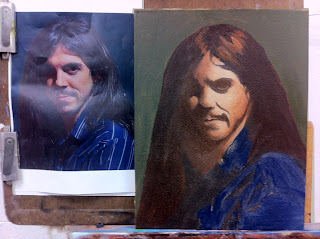
 I didn't have a color copy so I printed out a black and white reference on my home computer. I traced out my image onto tracing paper by taping it up on the big windows at the Calgary School of Art.
 I rubbed down the back of the tracing paper with vine charcoal, lined it up the way I liked the composition to appear on the canvas and traced back over top of my line to press the charcoal thru the paper and onto the ground.
 The canvas that was prepared last week with Lead white and textured
with a super sponge was wet sanded and given a rub of burnt umber
before beginning. I then inked in traced sketch with thinned down umber.
The canvas that was prepared last week with Lead white and textured
with a super sponge was wet sanded and given a rub of burnt umber
before beginning. I then inked in traced sketch with thinned down umber.
 I dead coloured my shadows first, the half tone for the skin and threw down come color for the shirt area.
 I added a background made up of yellow ochre, black and white and let it dry overnight while going back and forth between the other portrait of the girl I started (yesterday's post entry).

Our workshop Martinho Corriea gave a demo on creating a portrait. He is so skilled in his craft, he makes it look easy.


May 23, 2012
Portraits in Oils - Week 2 - Monday
Today we began work on a self-portrait based on the photo take by the instructor last week.
I decided to work on two canvas simultaneously. First because I had a prepped panel and a close up of the model from last week and It was holiday Monday and I didn't have a color print out of my portrait yet. I didn't have a chance to get one done since I was in Animation Lockdown all Long week-end. So this bit is a reminder of the steps before we get into the nitty gritty of my self portrait in oil.
.JPG) Back to stage 1 of creating the piece = drawing. Due to time constraints I traced out the face, from a photograph, on tracing paper and created a line drawing with the bed bug line (the line where the shadow meets the light).
Back to stage 1 of creating the piece = drawing. Due to time constraints I traced out the face, from a photograph, on tracing paper and created a line drawing with the bed bug line (the line where the shadow meets the light).
 The back of the tracing paper was rubbed down with vine charcoal. I then place it on top of the prepared ground (in this case canvas board rubbed down with a neutral color). Then the tracing paper was lined up over the canvas board until I had an adequate composition. I taped it down and retraced the line, imprinting charcoal onto the ground.
 I use raw umber thinned with mineral spirits to draw in the lines. This is to set down the composition and is referred to as the "cartoon". The lines emphasize the high and low points. Rather than use curvilinear lines that drift into inaccuracy, these are made up of small straight ones.
 The next step is to block in the shadows. I use burnt umber and white and begin the dead coloring starting with the shadow.
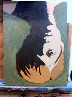 The next step is dead coloring the mid-tones in the lit side. This color was made of the base flesh tone ( red + yellow ochre + white) plus some red umber if needed for your model. I loosely filled in the mid-tones of the background with a mix of black, yellow ochre and a touch of flake (lead) white. The background could be done thicker but scrubbing it in quickly is fine since I will be going over it again.
 I began filling in the fall of light doing the big for modelling. You can see the highlight on the left side near the eye and it drops off. The focus here is getting the basic fall like on the flesh ball example.

I decided to work on two canvas simultaneously. First because I had a prepped panel and a close up of the model from last week and It was holiday Monday and I didn't have a color print out of my portrait yet. I didn't have a chance to get one done since I was in Animation Lockdown all Long week-end. So this bit is a reminder of the steps before we get into the nitty gritty of my self portrait in oil.
.JPG)


Here is is more softly blended with the additional tones added to create more form in the hair. As well you can notice the repainted flat background. After this dries I will have a chance to continue on with the first painting stage.
May 22, 2012
Painting Portraits in Oils workshop - Day 4 & 5
Second stage painting
 We started by oiling in the previous days work to bring the tones back up. Martinho gave a demo on second stage painting where you use the values mapped out previous and model the form more and bring out some of the varied colours in each area. We also looked at the work of other portrait painters to compare their handling of the subject and paint such as Raeburn and Sargent.
 I turned the painting upside down, which is a little optical trick to help me see the variation in the values and negatives shapes easier.The focus was to refine the work a little more and get to second stage painting in just one area. At lunch I took advantage of the last day of the half off sale at Cactus Art and got a bunch of new brushes, how could I resist, they were only 50 cents each,and some had sticker prices of over $10.
 As you can see, I got a handful and it was all under $20. They also gave me this brush tote for free to carry them in.
 I decided to begin whit the seemingly easiest portion of the body for second stage development the legs. I was having a frustrating time and spent nearly the entire day working them to create that feeling of dimension while maintaining the true fall of light. At time it was a frustrating challenge.
 It was necessary for me to bump up the chroma. They appeared dulled down and grey. I added more Persian red. Doing this made it much easier to closely resemble the original hues and create more form.
 I sat here and worked for at least 8 hours. The tabaret to my left has been emptied of supplies in this shot, but I tell you this little rolling shelf is such a valuable device. To break the monotonoy of just working on the legs, I danced around a bit in other areas, including the shadows.

By the end of the day I was overjoyed with my progress. Surprised at how much I could accomplish and how well it turned out. That's one of the secrets of making art, of not wrecking what you have done or going to far. You have got to know when to quit.......... quit while you are ahead!
That led me into a fun but busy week-end at Quickdraw Animation Society's Retro Lock down.
May 18, 2012
Painting Portraits in Oils workshop - Day 3
First painting
 We began the day with a demo by Martinho Corriea on the subject of first painting. The first step is oiling in the painting from the previous session. This is done with a 50/50 mixture or turpentine and linseed oil. This stage is where largest forms are modeled in the round. For example treat the leg as a column, but also pay attention to the fact that there is still the fall of light from the previous session. The torso becomes a rounded mass and you still work with simple light to dark and a large brush.
 At this stage there is no work into the dark areas. "Keep the darks thin and the lights thick". The objective of First Painting is to model the larger forms by trying to keep to the proper value shifts. This is why the fall of light is there, like a map you paint over but it helps you keep the values intact. It takes a lot of concentration and a few tricks with perception to get this right.
 My rag is under the canvas to give me a surface to wipe my brush clean. As you can see the form of the legs is rounder and there is a barrel shape to the chest. The bed bug line is still there and I had to go in and darken some of my shadow work. The largest forms are beginning to be described.
 Martinho continues to work on his piece.
I took a lesson and stuck my reference much closer to my canvas.
 I worked on the background gradation a bit more. I punched up the shadows a bit. I also put in a few lighter tones into the navel regions shadows. My paint was looking scraggly and Martinho's advice was MORE PAINT! I have always been so conservative with my use of paint, but as he says paint is cheap (at least some colors are). At any rate he is absolutely right! I'm so used to not using much because it dries up in between sessions, and by being cheap, I've been rubbing out rather than applying thick, a habit that needs changing if I want rich looking canvases.
 I was very frustrated learning to work in a new way and not being as proficient as my mind thought I should be. By the end of the session I wanted to be done more. I have a new found respect for the subtlety of light and shadow and peoples ability to render great realistic looking tones in oil paint. I'm happy I got out of there in one piece! I took out my frustration in Martial arts class afterward.


I took a lesson and stuck my reference much closer to my canvas.


Subscribe to:
Posts (Atom)