October 29, 2015

Mastery of paint . . .

After a week, at least one student finished the grisaille on her Leonardo  davinci hand study and it looks amazing.
After adding glazing layers it will no longer have an overall blue cast hue and it will spring to life due to the good values in the grisaille layer.
A freehand interpretation of a character from a Caravaggio painting.

Beginning a new composition by getting the major shapes onto the support to block in with colour.

We begin blocking in the major colours in their personal compositions using a different method (direct application) more akin to the french academic method of the 19 ce.
This bowl of cherries will scream with colour in a couple of sessions.
This piece on a dark ground is from a historical of her families farm which was right next to the ocean, cool!
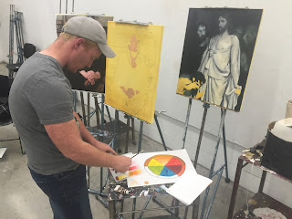
Full size references, colour wheel exercise complete now onto a portrait of his mom, that he thinks she wont like.
As long as the teacher doesn't say "she looks like a dried out old pumpkin", all will be fine.


October 25, 2015

Drawing 1 - still life

This Saturday we are fortunate enough to draw things that don't move - still life. Each student brought in their own objects to set up and study. I demonstrated the technique of constructing transparent shapes along side the proper use of proportions at the start of the class and gave them step by step notes of the process as one moves toward the finishing details and shading.
The first key to getting it right is to get it right from the start. Its too difficult afterward to change placement or proportions, best spent the time observing, measuring and ensuring the overall placement of the composition is correct before moving onto the details.
If and when the overall forms are well constructed, you can remove the construction lines and move toward values of light and dark. It is far more interesting to have varied textures, shapes and sizes when planning a still life drawing.
Interesting objects juxtaposed make for visual narrative, then you can move into creating the convincing illusion of depth using shifts in the values of light and dark.
and then you just observe what you see and translate it onto your drawing surface. Sounds easy, but it could be a serious endeavor, one that can definitely take more time than the allotted class length. But once you learn the steps in the process you have the necessary tools to take it wherever you want to go.
The students were super quiet and focused the entire class, and the work really showed their focus and concentration. Great work guys and gals! Next week all sorts of graphical perspective drawing techniques!


October 22, 2015

Master Painitng @ ACAD

I am teaching the techniques of the old masters in 7 intense classes. We start with our support and move quickly into a copy and grisaille work by class 3.
I have to bring a lot of supplies and references to the class which means loading in and out and paying way too much for SAIT parking.
 In the first class I teach a few ways to construct and prepare good sturdy supports. If you are going to spend all that time making quality work, you should definitely invest in a quality foundation.
Class 2 we draw and develop the imprimatura stage. The students draft their composition and transfer their images to the support allowing it to dry before continuing on with the next layer.
To do grisaille you need some grey paint, by mixing black you can control its warmth or coolness and then create all the values you need to apply to the canvas.
Making a quick copy of a part of a masters work and experimenting with the flemish or venetian technique helps to understand the process the masters employed in their practice.
ACAD came in a filmed a bit of the class. I thought I snapped more pictures for this blog myself but my gear has been acting up. Luckily his wasn't, so stay tooned, there will be more to come!


October 20, 2015

Terrarium Tuesday!

Its a beautiful sunshiney post election day. i decided before heading to my wheel throwing class to take those two empty carboys my neighbor gave me and turn them into tropical rain forest terrariums.
Step one I clean out the carboys, gather all the things I'll need, a few things not pictured here are my home made tools and potting soil. I picked up some of the plants at Plant in Inglewood, others at Home Depot.
I grabbed the gravel, moss and activated charcoal at the pet smart nearby.
I layered in the clean gravel and charcoal etc.
Meanwhile I soaked the moss brick that will act as a substrate layer between the soil and rocks and charcoal.
I had to separate it and tamp it down with a tool i made by taping some gardening wire to a pole and making a flat disk.  I spread it evenly and this is where I felt a bit like a guy who puts ships in bottles.
Next I put in a healthy layer of potting soil and tamped it down with the tool while adding a bit of moisture. The same tool was used to create holes in which to place the root balls.
I looked all over for one of these grabber tools. My neighbor happened to be cleaning out his garage and found two, so he gave me one for my project. Win! It makes it really easy to lover and place the plants into the holes I created,  then press them down and cover them with dirt with the other tool.
Here is the first one planted with a variety of tropicals. I give it a final watering, as it should create its own habitat, leading to very little need for additional watering.
I planted the second one, they both went a lot better than I expected thanks to the right tools. I wiped the inside down with a paper towel attached to a rod and brought them back over to my place.
I placed them side by side in my living room which is rather low light but north facing. I look forward to seeing how they grow in the future. Maybe I'll make some more with the leftover supplies.




October 4, 2015

Swinton's Sunday Oil Sampler

Success! often it's hard in such a short period of time to relay a portion of my knowldege and all of my love for oil paint to people who are trying it for the first time. It can also be difficult at first but the rewards of seeing it thru are well worth it! With so little time it can get messy and muddy, but hopefully that takes a back seat to their beauty and oils rich creamy qualities.
I did a quick demo and changed the format of this class based on all the feedback and I think it really worked out well today. I spent less time on colour mixing and background and game them way more time to jump in as its needed with oils.
-->
For me there is nothing more fulfilling or beautiful than creating art work in oil paint. I have so much respect for art made in the medium of oil. They are rich in color and in history. There is a wealth of written material in which to draw, plus oil paintings survive the test of time.

 I love the variation each person brings to the class, especially how different each persons take is on colour mixing. Each persons reasons for painting are different so are their unique backgrounds and aesthetic decisions.
We work from dark to light, from distant to near and up to down using large brushes to smaller ones. All the while adding fat over lean as thin paint sticks to thick paint. So much to know and remember, but it is process intensive and has a lot of history and tradition built in.
 
The colour on this one reminded my of Francis Bacon for some reason. The method I teach is an effective and systematic way to paint. But don't let that fool you into thinking that dries up the spontaneous artistry involved.
Some of the feedback I have had in past evaluations is that a few people want more time in the sampler and to work on larger sized supports. It is something worth considering in future as this may work for many but might deter others. This would then change the price point and may be too much for first timers. Right now, the samplers are consistently sold out every time so we may just have the recipe right.


Hey look at this:  http://www.swintonsart.com/blog-articles/item/welcome-brian-batista


October 3, 2015

Drawing 1 class at ACAD - Value studies

My drawing class this semester is fantastic!  We have been studying the FUNdamentals such as values, tone and proportion as well as how to set up the drawing space and see a little bit differently.
I love this picture, its Philips back and the classroom set up, it has a certain melancholic quiet, at the top of his paper is his value chart and he studies the subject matter, my plaster shapes. This would make a great image for the back of a business card in my opinion.
Here they are all on their own. Of course, once the lights go out the artists need to adjust their eyes in a way that this camera has not to really see the variation of lights and darks and translate those with their pencils onto paper.
Here a student is getting shaded tones including reflected light one of the platonic solids. Nice work.
I start with values to help my sutdents visualize how light and dark, even in the absence of colour, plays a huge role in describing three dimensional objects on a two dimensional surface(the paper). To me this is one of the hurdles and challenges of good representational drawing skills.
The following session we work on toned paper and focus on getting proper relative proportions before we begin shading from light to dark. I think their works were very successful and will miss not having class next week due to the Thanksgiving holiday.


October 1, 2015

Urban escape Float Therapy hand painted sign

Friends of mine have this nifty little place on Edmonton Trail called Urban Escape.

I just finished fixing up their painted signage. Have you seen it while passing by? Have you tried a float yet?
The stencil on the textured wall left a lot of over spray as well as the cut out marks.
I wanted to crisp up the letters around the edges and get rid of the missing areas of the lettering while maintaining the lower wave like band.
Up a ladder, I block in the charcoal grey first, people on Edmonton trail keep commenting on my butt while up here, must be the angle.
Here is the one side all cleaned up. The address is 208 Edmonton trail and they are open.
Here is the other side of the building after I blocked in the charcoal lettering. The over spray makes it look real gritty which I why I was compelled to tidy it up.
And here it is completed. I love how the late afternoon sun cast the shadows.

Visit uescape.ca to try a float.