
Showing posts with label palette. Show all posts
Showing posts with label palette. Show all posts
July 3, 2017
February 24, 2015
Oil Sampler this Sunday at Swintons
I've given away all my Sundays, not to church, but to the temple of art at Swinton's and I love it. There is no other place I'd rather be that within the walls of the studio praising creativity.
 I lay out everything we need and begin the session with an overview of the entire process and the materials etc before beginning the demos.
 Just as in the studio, I like to start the session with a good half an hour setting up the palette. Here the students have a chance to experience the feel and properties of the material by mixing colour wheels as well as tints and tones. This is where the fun really begins. Oil can be sticky and takes some time to get used to its wonderfully creamy properties.
 We plan out our compositions then block in with big brushes the large areas of colour. I like how this sampler students piece looks already, good start and great tones on the support surface.
 More detail and smaller brushes are used as the piece develops. Pretty good for 3 hrs, with demos, lectures and a store tour, how to clean up etc. If you are interested in trying out oil or acrylic with me sign up at Swinton's today! The next one is Acrylic happening Sunday, March 1st, 12:30 -3:30 pm. Click here for to sign up.
February 15, 2015
A little sampling
Every few Sundays I get the chance to introduce fledgling creators to new materials at Swintons through their samplers. It is a great joy to have a group of people who have never painted come in and 3 hrs. later they have a solid foundation and walk out having painted their first piece.
 This particular class we focused on Acrylic paints. Swintons provides everything you need to get started, even gloves if you want. Lol. She put on that blue super heavy, she took my oil sampler last week and wanted to see how the two mediums contrast and compare.
 Each participant gets to choose their own subject, we have a large box of examples to choose from or you can bring in your own. At least I don't scare them away from art by making it a class type assignment like shading a ball or painting the ol' trusty pear.
 This looks like a fun palette to work with. Some work on an easel others on the table. Whatever works.
 This participant had experience in watercolour and I really like her command of the colours in a very rich medium. Its hard to believe sometimes that these are not well seasoned painters.
 This floral painting turned out really beautifully, and just in time for Valentines day!
January 9, 2013
Back to dead coloring angel of death
After sitting and looking at the piece again I decided I definitely had to tweak it a bit more in terms of the angle of the body in the composition as well as make the skull bigger on the birds body.
.JPG) I drew in charcoal right on top of the previous design. I had the bird arch its head further so that it looked a bit more like it was turning around to face the viewer. I also raised the talon up a bit higher and made the skull larger and tilted at a slight angle to work well with the angle of shoulder of the wing.
I drew in charcoal right on top of the previous design. I had the bird arch its head further so that it looked a bit more like it was turning around to face the viewer. I also raised the talon up a bit higher and made the skull larger and tilted at a slight angle to work well with the angle of shoulder of the wing.
.JPG) Here is the small skull model I am using as a reference point for my drawing. The lighting will be different based on my knowledge of the shape, but who knows I may use this quick snapshot more than I anticipate.
Here is the small skull model I am using as a reference point for my drawing. The lighting will be different based on my knowledge of the shape, but who knows I may use this quick snapshot more than I anticipate.
.JPG) I laid out the colours I intended to use for the basic filling in of the body. Cobalt and Cerulean Blue, Green and yellow, Deep, light and cadmium red and Titanium white for mixing. I blended up a 3:1 linseed oil to mineral spirits medium with one drop of cobalt drier to help speed things up a bit.
I laid out the colours I intended to use for the basic filling in of the body. Cobalt and Cerulean Blue, Green and yellow, Deep, light and cadmium red and Titanium white for mixing. I blended up a 3:1 linseed oil to mineral spirits medium with one drop of cobalt drier to help speed things up a bit.
.JPG) I blocked in the basic colors of the parrots body as well as the skull with some shadowing to help see the forms. I then took some burnt sienna and put in some of the background tone.
I blocked in the basic colors of the parrots body as well as the skull with some shadowing to help see the forms. I then took some burnt sienna and put in some of the background tone.
.JPG) This is where I have the most fun. I use the paint tube as if it were a crayon. The lines are quick and natural and expressive. At times I wonder if this is not my true art form and that I should try to go further with it, and not try to paint things at all. That may be more ballsy that I'm ready for.
This is where I have the most fun. I use the paint tube as if it were a crayon. The lines are quick and natural and expressive. At times I wonder if this is not my true art form and that I should try to go further with it, and not try to paint things at all. That may be more ballsy that I'm ready for.
.JPG) I blocked in the remaining background with Burnt Sienna right on the canvas. It really flattens the image out but once it dries there will be much more detailed work done on top. For now, it has richly colored masses to work on.
I blocked in the remaining background with Burnt Sienna right on the canvas. It really flattens the image out but once it dries there will be much more detailed work done on top. For now, it has richly colored masses to work on.
.JPG)
.JPG)
.JPG)
.JPG)
.JPG)
.JPG)
October 10, 2012
LAKSHIMI - fleshed out
I blocked in the dark shadow areas first then did the next closest midtone which in this case was an Old Holland brand red umber with a bit of white added. I then did my mid-highlight areas but kept it rather dark throughout.
I blocked in the general shape and tones of the face adding a slight bit of red into the cheeks and lips.
August 6, 2012
Ganesh gets a skin treatment
I created a palette of ranges and a tonal range from black to white.
 I proceeded to describe the general fall of light over the Ganesh body. I started with the eyes because it is always a good place to start, hence the greys to shade the eyeball.
 Starting at the bottom feet is a vibrant orange. As it moves up the body it gets more golden. I included some shadow areas along the way but will be revisiting them again later in another layer.
 I added "flesh tone" to the palm and bottoms of the feet. Although this flesh tome is hardly fleshy at all and generally seems Pink to me. Then I attacked areas with bold strokes of read. There is beginning to be some back and forth play between me and the canvas now, we begin having a conversation.
 By the end of the session, my brushes and colors are getting a little muddy so I step back to assess some of the advances and mistakes that have developed and take a breather until the next session.


May 28, 2012
Portraits in Oils - Week 2 - FRIDAY
.JPG)
We began the day slowly. I think the reluctance to start stems from a few areas, fatigue, was a major one, but mostly we didn't want it to end. We stood around as Martinho covered glazes, with a video from a surly guy from Brooklyn telling it exactly how it is, quite refreshing. A glaze is just thinned down paint used to tweak the tone if needed a the end.*
*With this style of painting that glazing is unecessary if you did it right the first time, I need to make an additional clause: VERMEER AMENDMENT! (glazing over a Grisaille under painting method.)
*With this style of painting that glazing is unecessary if you did it right the first time, I need to make an additional clause: VERMEER AMENDMENT! (glazing over a Grisaille under painting method.)
.JPG)
I oiled in and then decided to rework the girls face because I like torturing myself. Mainly I felt the need to assert that I had in fact learned to understand the value system and to work with my palette. Plus I wasn't happy with it, I knew I could do better and when you have a pro who can give you feedback it helps, 'cause in the studio you have no one to help. So though it looks a little messy, I went back to the first stage of controlling the fall of light/big form modelling stage. Her chin area wasn't dark enough before and it was throwing off the whole relationship between values. This helped solidify some of what I had learned throughout the workshop.
.JPG)
Here are some examples of Martinho's work. The top is a copy he made from one of his teachers pieces. He has not only fantastic drawing skills to get the details and proportions right but also superb control of the subtlety of values and colour. That is a skill in my craft that I badly desire. In the bottom piece if you start at the feet you can see the beginning stages of the work, as you follow up the leg to the thigh you pass the dead coloring stage and get to the big form modelling stage. As you travel up the light side of the ribs and arm you see masterfully finished work, and for me, my jaw drops the the beauty in which he subtly renders the figure to perfection.
.JPG)
At the lunch break, I helped another participant, Darryl, with his HD camera. After the lunchbreak, We we introduced to the theory of colour for broken colur backgrounds. This is where if you look from a distance the background appears to be say greenish, but as you get close you realize those greens are mixed in your eye and in fact, it is made up of a variety of other colours. first there is th movement of tone in the background, from low to high value. With each of those colours you then mix a breakdown of each with low and high chroma. Green is made up of yellow and blue so you mix a yellow and blue of high and low chroma for each value that will go on the canvas. It may be equal to a day of work, but the effect is quite stunning.
.JPG)
I revisited the work from the first week to play with the background. This piece was a learning lesson and will most likely be abandoned unless I really feel like making it into something, I hung it in my studio as a reminder. I barely got the legs to second stage painting but you can really see how this method lends itself to creating realistic looking figures, for me the legs seem to pop. Now I need to keep working on my craft and develop and loose sensitivity to applying the paint subtly like the masters.

Here is a scene from the workshop, the craziness of an arts studio while we are in it creating. Now it site empty. The other participants were a joy, through the trials and tribulations. I kept thinking that this is what art school should have been like, the work ethic and the challenges making ti worth while to show up daily. Like the studios for training the masters back in the day. I learned so much in so little time. It renewed my vigor to attain artistic mastery. I asked myself, why hadn't I done this so long ago?!
.JPG)
Here are me and my half Portugeuse bretheren and workshop Instructor Martinho on the last day. Teh Bob Ross shirt is definitely tongue and cheek when you know the level of work and quality we hope to attain. It cant be done watching a half of an hour PBS TV program. I want to impart why this pursuit toward beauty matters to me so much. I feel vigorously renewed after this training, my goals in life redefined:
Beauty is my muse.
It is the essential life blood of my existence.
I am an artist.
I make beautiful things to look at.
The job of the artist is to uplift the soul.
I must become the best at my craft so that I can do this.
If you see beauty in everything your soul is set free.
This brings me happiness.
May 26, 2012
Portraits in Oils - Week 2 - Thursday
First and Second painting stages
.JPG)
Regular start to the day, set up my area for working. Oil in on both pieces to bring up the darks. The morning chat was extended over some coffee and donuts the nice ladies brought in, I know I'll regret it later though. My medium for the day is 1: 1 (1 Damar to 1 oil) + a little cobalt drier to speed things up.
.JPG)
The most important thing I've found out is to put the time in to properly lay out my palette. Today I further refined it and it is really helping the work progress.
.JPG)
Struggling with this female portrait, I decide to refine the shadows in order to help me really "see" the values. On some parts I mixed Persian/Indian red straight in from the tube and blended it on the canvas. I am surprised how much chroma is needed, further emphasizing the importance of as high quality materials as you can afford.
.JPG)
.JPG)
.JPG)
.JPG)
.JPG)
May 25, 2012
Portraits in Oils - Week 2 - Wednesday
big form modelling...
I began by oiling in. The first color I started with the basic flesh color. The basic idea is to make the head into a flesh ball of sorts. By examining the planes of the head and where the light is hitting it makes it easier to get the basic turning of the simple form.
 The medium I used was a 3:1. That is 3 parts solvent/Damar varnish mix to 1 part linseed oil. A good place to start is with a bit of red umber mixed with white and starting near the bed bug line. Commit this to memory: "the darkest light should be lighter than the lightest dark". Already the image has moved away from flat Warhol like image to a rounded naturalistic form.
.JPG) I jumped back and forth between canvases once the paint got overworked and tacky due to the rapid drying provided by the addition of a few drops of cobalt drier. Here you can see the modelling of the form of the girls face, done in much the same way. It is becoming apparent how important the early stages, though seemingly simple, make up the map you will need later on to take the picture work.
I jumped back and forth between canvases once the paint got overworked and tacky due to the rapid drying provided by the addition of a few drops of cobalt drier. Here you can see the modelling of the form of the girls face, done in much the same way. It is becoming apparent how important the early stages, though seemingly simple, make up the map you will need later on to take the picture work.
.JPG) One method I'm working with is learning how to properly use a well laid out palette. Here is my first try. Its simple but it seems to work. I've strung out the main colors of the flesh palette we are using. It helps to understand the changes in value and tonality and how to use it systematically to the best effect.
One method I'm working with is learning how to properly use a well laid out palette. Here is my first try. Its simple but it seems to work. I've strung out the main colors of the flesh palette we are using. It helps to understand the changes in value and tonality and how to use it systematically to the best effect.
.JPG) Another pointer, and I'm picking up a lot of good working skills, is to
have two containers of turpentine, one for the first clean of the
brushes and my smaller one for the cleaned brushes used for thinning,
that way I wont get muddied colors while working. Also use more paint and have more chroma, in order to guard against inadvertent greying of my tones.
Another pointer, and I'm picking up a lot of good working skills, is to
have two containers of turpentine, one for the first clean of the
brushes and my smaller one for the cleaned brushes used for thinning,
that way I wont get muddied colors while working. Also use more paint and have more chroma, in order to guard against inadvertent greying of my tones.
.JPG) The next step after the big form modelling is to work on the planes of the face. This is where small color shifts based on the values are added in. We had a reference picture to simplify the planes of the face, very useful. I also had to go back into my shadows and darken them to get more depth in my image. I worked on creating more form and tonality in the shirt. You can see how having the initial big form modelling is a real asset/
The next step after the big form modelling is to work on the planes of the face. This is where small color shifts based on the values are added in. We had a reference picture to simplify the planes of the face, very useful. I also had to go back into my shadows and darken them to get more depth in my image. I worked on creating more form and tonality in the shirt. You can see how having the initial big form modelling is a real asset/
.JPG) I went back and forth into the two portraits. Here I built more into the female face but was really struggling to maintain her beauty, while my work was still to flat and the creases and planes too well defined to be believable.
I went back and forth into the two portraits. Here I built more into the female face but was really struggling to maintain her beauty, while my work was still to flat and the creases and planes too well defined to be believable.
.JPG)

.JPG)
.JPG)
.JPG)
.JPG)
.JPG)
.JPG)
I ended off on a positive note with my self portrait. Got some color in the lips. Nice form on the forehead and some definition in the shadow areas and some depth developing in the clothing and background. Looking forward to the Animation Lock down tonight and hump day coming to a close so I can get a little rest and really make a charge on the last two days of the workshop.
May 24, 2012
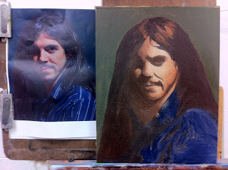
Portraits in Oils - Week 2 - Tuesday
Self - portrait

 I didn't have a color copy so I printed out a black and white reference on my home computer. I traced out my image onto tracing paper by taping it up on the big windows at the Calgary School of Art.
 I rubbed down the back of the tracing paper with vine charcoal, lined it up the way I liked the composition to appear on the canvas and traced back over top of my line to press the charcoal thru the paper and onto the ground.
 The canvas that was prepared last week with Lead white and textured
with a super sponge was wet sanded and given a rub of burnt umber
before beginning. I then inked in traced sketch with thinned down umber.
The canvas that was prepared last week with Lead white and textured
with a super sponge was wet sanded and given a rub of burnt umber
before beginning. I then inked in traced sketch with thinned down umber.
 I dead coloured my shadows first, the half tone for the skin and threw down come color for the shirt area.
 I added a background made up of yellow ochre, black and white and let it dry overnight while going back and forth between the other portrait of the girl I started (yesterday's post entry).

Our workshop Martinho Corriea gave a demo on creating a portrait. He is so skilled in his craft, he makes it look easy.


Subscribe to:
Posts (Atom)