a process of a dying art form.
I was asked to hand paint signage for a new venue called the NATIONAL. It is another development by the Concord group (which I am working on animation for another space of theirs: Clive Burger) National is a really beautiful space. It is designed with a roaring 20's - dirty thirties classic appeal. The woods are deep and glossy, white hexagon tiles are balanced with glossy black sideboards. There are 75 brass beer taps and the feel that there might be a good horse race, so check the newspaper.

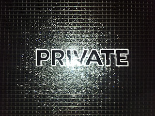
My task is to paint the signage on the glass doors for the various rooms: "Ladies, Gentlemen, Private, Washroom and National". The reason I am excited is that I am given the opportunity to venture into the world of a dying art from yester-year. I went out and picked up supplies. The paint I'll be using is called "one shot", and it is great to work with. It is an enamel that is deep and glossy, rich and powerful. It is also dangerously toxic.

It took me some time and quite a bit of research to put together my quote and get up the nerve to round up all the tools and means to pull this off. I got the
Gotham font type they wanted with the -50 tracking and printed them out at a size relative to the windows that would look best. My plan was to place the printed stencils on the window backs, tape them up then proceed with the lettering on the smoother side of the window. First the black bulk of the letter, then I had to wait until it was completely dry before I can outline in lettering white with a liner brush. I was hoping to have some time to make some swatch varieties for the designer before beginning, but she said go ahead with the job since we have just over a week to get it done.
The windows are from an old historical building (the grain exchange) and needed to be scraped and cleaned properly before I started working. Mostly my time over the two full days of work was prepping the space ad getting ready to apply the one shot. There is definite learning curve. The one thing that is good is my ability and confidence in painting a straight line.......after all its called
"one shot"- You can't keep pulling the line, you have one chance to get it right. It took a few goes to get my wits and my wrists working for me. Some of the windows aren't smooth which makes it more difficult, but hey, I like a challenge! I tried to paint on the bubbly or stippled side but you just can't get straight lines. I also learned that the tape across the top and bottom bleeds the paint so its good for lining up the text elements but it doesn't properly mask it out.

They wanted their name on the front door panels in gold upon entry and their star logo on the window. I hand cut a stencil from the illustrator file their designer provided me so I could apply a spray gold to ensure their logo was accurate since I heard the owner was a real stickler for that type of brand identity perfection. The paint on the doors already seemed to be chipping. I was concerned about working on this surface but I went ahead anyway. The starts would have to be painted on the back, the smooth side. I didn't go ahead with them because I was unsure of the placement.

It took a long time to get it placed right, and masked to protect from overspray. Hand painted signage is one thing, masking is another beast all together. I ended up not liking how it turned out, more so where it is placed. i much preferred the look of the painted windows. Though I did a lot of work here, I want the work to be regarded as perfect, I will be pitching the designer the idea to sand off this signage and to go with the white and black lettering on the window instead. I feel it will look much better on a front entrance door, a little more subtle but much more stylish!

As I stood there, within inches of the work, being that close I noticed every slight imperfection in my work, it was really hard to let go of the fact that hand painted signage would never look perfect. I worried that I wasn't able to produce professional quality work, especially when you compare it to how mechanically perfect computer design and printing on vinyl can be. It made me insecure to think that this wouldn't stand up tot eh professionalism this space deserved. It is the style of the era they are going for. I contacted the designer to meet since I was at the point where I was willing to scrape all my work off before I move on and to get the okay to move forward. My main goal is to make sure they are satisfied with my work whether or not I lose time and money on this project, I want to continue to get more professional as more connections in the commercial sector.
As well as get better in handling the materials = all pro!


